262 Commits (d20b29d7cea0fcba5e423dcfb7bbb7d2c15959d6)

Author SHA1 Message Date
HesterG d20b29d7ce
Fix height for sticky head on large screen on PR page (#23111)
Right now on the PR 'File Change' Tab, the file title header sticky to
the top on large screens has wrong height, resulting in wrong ui
behavior when scrolling down. This PR is to fix this.

Before:

<img width="964" alt="截屏2023-02-24 17 12 29"
src="https://user-images.githubusercontent.com/17645053/221140409-025c4a84-6bbe-4b5b-a13f-bd2b79063522.png">

After:
<img width="1430" alt="截屏2023-02-24 21 10 12"
src="https://user-images.githubusercontent.com/17645053/221186750-0344d652-4610-4a90-a4c0-7f6269f950d6.png">
1 year ago
HesterG 8ed6096158
Add wrapper to author to avoid long name ui problem (#23030)
This PR is a possible solution for issue #22866. Main change is to add a
`author-wrapper` class around author name, like the wrapper added to
message. The `max-width` is set to 200px on PC, and 100px on mobile
device for now.
1 year ago
wxiaoguang 1fcf96ad01
Improve PR Review Box UI (#22986)
This PR follows: 
* #22950

### Before

The Review Box has many problems:

* It doesn't work for small screens.
* It has an anonying animation which makes the UI laggy.
* It uses "custom dropdown menu" which is very difficult to fine tune.
* `$().toggle('visible')` is not a correct call 
* jQuery just accepts any invalid `duration` argument:
`$().toggle('anyting')`
* The button is not a button.

<details>

![image](https://user-images.githubusercontent.com/2114189/219948865-6da3f39c-6fde-4c86-9e42-da5020f3d0c3.png)

</details>

### After

These problems are fixed, and eliminate many `!important` games.

<details>

![image](https://user-images.githubusercontent.com/2114189/219952744-8862fe1a-7ef1-49e4-bf92-2d0c1f104ee4.png)

![image](https://user-images.githubusercontent.com/2114189/219952771-be169a76-45fd-47a8-8f9c-b447d064f4ca.png)

![image](https://user-images.githubusercontent.com/2114189/219952784-3f52e9b7-64ce-4ad1-9553-64c33fb83042.png)

</details>

And most dropdown icons still looks good:

<details>

![image](https://user-images.githubusercontent.com/2114189/219952942-52866a00-e0f9-4af7-8fb5-eb1a8cad1ff3.png)

![image](https://user-images.githubusercontent.com/2114189/219948909-b3bfb844-f84e-4b79-ab1f-382ec66dec31.png)

</details>

Co-authored-by: delvh <leon@kske.dev>
1 year ago
oliverpool 3596df52c0
Fix hidden commit status on multiple checks (#22889)
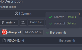
Since #22632, when a commit status has multiple checks, no check is
shown at all (hence no way to see the other checks).

This PR fixes this by always adding a tag with the
`.commit-statuses-trigger` to the DOM (the `.vm` is for vertical
alignment).

![2023-02-13-120528](https://user-images.githubusercontent.com/3864879/218441846-1a79c169-2efd-46bb-9e75-d8b45d7cc8e3.png)

---------

Co-authored-by: Lunny Xiao <xiaolunwen@gmail.com>
1 year ago
wxiaoguang d32af84a10
Refactor hiding-methods, remove jQuery show/hide, remove `.hide` class, remove inline style=display:none (#22950)
Close #22847

This PR:

* introduce Gitea's own `showElem` and related functions
* remove jQuery show/hide
* remove .hide class
* remove inline style=display:none 

From now on:

do not use:
* "[hidden]" attribute: it's too weak, can not be applied to an element
with "display: flex"
* ".hidden" class: it has been polluted by Fomantic UI in many cases
* inline style="display: none": it's difficult to tweak
* jQuery's show/hide/toggle: it can not show/hide elements with
"display: xxx !important"

only use:
* this ".gt-hidden" class
* showElem/hideElem/toggleElem functions in "utils/dom.js"

cc: @silverwind , this is the all-in-one PR
1 year ago
Brecht Van Lommel 6221a6fd54
Scoped labels (#22585)
Add a new "exclusive" option per label. This makes it so that when the
label is named `scope/name`, no other label with the same `scope/`
prefix can be set on an issue.

The scope is determined by the last occurence of `/`, so for example
`scope/alpha/name` and `scope/beta/name` are considered to be in
different scopes and can coexist.

Exclusive scopes are not enforced by any database rules, however they
are enforced when editing labels at the models level, automatically
removing any existing labels in the same scope when either attaching a
new label or replacing all labels.

In menus use a circle instead of checkbox to indicate they function as
radio buttons per scope. Issue filtering by label ensures that only a
single scoped label is selected at a time. Clicking with alt key can be
used to remove a scoped label, both when editing individual issues and
batch editing.

Label rendering refactor for consistency and code simplification:

* Labels now consistently have the same shape, emojis and tooltips
everywhere. This includes the label list and label assignment menus.
* In label list, show description below label same as label menus.
* Don't use exactly black/white text colors to look a bit nicer.
* Simplify text color computation. There is no point computing luminance
in linear color space, as this is a perceptual problem and sRGB is
closer to perceptually linear.
* Increase height of label assignment menus to show more labels. Showing
only 3-4 labels at a time leads to a lot of scrolling.
* Render all labels with a new RenderLabel template helper function.

Label creation and editing in multiline modal menu:

* Change label creation to open a modal menu like label editing.
* Change menu layout to place name, description and colors on separate
lines.
* Don't color cancel button red in label editing modal menu.
* Align text to the left in model menu for better readability and
consistent with settings layout elsewhere.

Custom exclusive scoped label rendering:

* Display scoped label prefix and suffix with slightly darker and
lighter background color respectively, and a slanted edge between them
similar to the `/` symbol.
* In menus exclusive labels are grouped with a divider line.

---------

Co-authored-by: Yarden Shoham <hrsi88@gmail.com>
Co-authored-by: Lauris BH <lauris@nix.lv>
1 year ago
Ferdinand Thiessen 8bba7e30b2
webview: Fix overflowing diff body (#22959)
If the content is quite large the diff body overflows the container and
can not be read.
This is fixed by setting the diff body maximum width to 100% and enable
overflow scrollbars:

before | after
---|---

![Screenshot_20230217_184716](https://user-images.githubusercontent.com/1855448/219733934-75bec38c-7cfe-47bb-b001-b090c02b769e.png)
|
![Screenshot_20230217_184655](https://user-images.githubusercontent.com/1855448/219733971-4db092d1-ffcb-4298-a640-f740a3ac430b.png)

Signed-off-by: Ferdinand Thiessen <rpm@fthiessen.de>
1 year ago
gempir e460b6ef4d
Fix PR file tree folders no longer collapsing (#22864)
Collapsing folders currently just throws a console error

```
index.js?v=1.19.0~dev-403-gb6b8feb3d:10 TypeError: this.$set is not a function
    at Proxy.handleClick (index.js?v=1.19.0~dev-403-gb6b8feb3d:58:7159)
    at index.js?v=1.19.0~dev-403-gb6b8feb3d:58:6466
    at index.js?v=1.19.0~dev-403-gb6b8feb3d:10:93922
    at ce (index.js?v=1.19.0~dev-403-gb6b8feb3d:10:1472)
    at Q (index.js?v=1.19.0~dev-403-gb6b8feb3d:10:1567)
    at HTMLDivElement.$e (index.js?v=1.19.0~dev-403-gb6b8feb3d:10:79198)
```

This PR fixes this and allows folders to be collapsed again.

Also:
- better cursor interaction with folders
- added some color to the diff detail stats
- remove green link color from all the file names

Screenshots:

![image](https://user-images.githubusercontent.com/9765622/218269712-2f3dda55-6d70-407f-8d34-2a5d9c8df548.png)

![image](https://user-images.githubusercontent.com/9765622/218269714-6ce8a954-daea-4ed6-9eea-8b2323db4d8f.png)

---------

Co-authored-by: zeripath <art27@cantab.net>
Co-authored-by: Lunny Xiao <xiaolunwen@gmail.com>
1 year ago
Jason Song 4011821c94
Implement actions (#21937)
Close #13539.

Co-authored by: @lunny @appleboy @fuxiaohei and others.

Related projects:
- https://gitea.com/gitea/actions-proto-def
- https://gitea.com/gitea/actions-proto-go
- https://gitea.com/gitea/act
- https://gitea.com/gitea/act_runner

### Summary

The target of this PR is to bring a basic implementation of "Actions",
an internal CI/CD system of Gitea. That means even though it has been
merged, the state of the feature is **EXPERIMENTAL**, and please note
that:

- It is disabled by default;
- It shouldn't be used in a production environment currently;
- It shouldn't be used in a public Gitea instance currently;
- Breaking changes may be made before it's stable.

**Please comment on #13539 if you have any different product design
ideas**, all decisions reached there will be adopted here. But in this
PR, we don't talk about **naming, feature-creep or alternatives**.

### ⚠️ Breaking

`gitea-actions` will become a reserved user name. If a user with the
name already exists in the database, it is recommended to rename it.

### Some important reviews

- What is `DEFAULT_ACTIONS_URL` in `app.ini` for?
  - https://github.com/go-gitea/gitea/pull/21937#discussion_r1055954954
- Why the api for runners is not under the normal `/api/v1` prefix?
  - https://github.com/go-gitea/gitea/pull/21937#discussion_r1061173592
- Why DBFS?
  - https://github.com/go-gitea/gitea/pull/21937#discussion_r1061301178
- Why ignore events triggered by `gitea-actions` bot?
  - https://github.com/go-gitea/gitea/pull/21937#discussion_r1063254103
- Why there's no permission control for actions?
  - https://github.com/go-gitea/gitea/pull/21937#discussion_r1090229868

### What it looks like

<details>

#### Manage runners

<img width="1792" alt="image"
src="https://user-images.githubusercontent.com/9418365/205870657-c72f590e-2e08-4cd4-be7f-2e0abb299bbf.png">

#### List runs

<img width="1792" alt="image"
src="https://user-images.githubusercontent.com/9418365/205872794-50fde990-2b45-48c1-a178-908e4ec5b627.png">


#### View logs

<img width="1792" alt="image"
src="https://user-images.githubusercontent.com/9418365/205872501-9b7b9000-9542-4991-8f55-18ccdada77c3.png">


</details>

### How to try it

<details>

#### 1. Start Gitea

Clone this branch and [install from
source](https://docs.gitea.io/en-us/install-from-source).

Add additional configurations in `app.ini` to enable Actions:

```ini
[actions]
ENABLED = true
```

Start it.

If all is well, you'll see the management page of runners:

<img width="1792" alt="image"
src="https://user-images.githubusercontent.com/9418365/205877365-8e30a780-9b10-4154-b3e8-ee6c3cb35a59.png">


#### 2. Start runner

Clone the [act_runner](https://gitea.com/gitea/act_runner), and follow
the
[README](https://gitea.com/gitea/act_runner/src/branch/main/README.md)
to start it.

If all is well, you'll see a new runner has been added:

<img width="1792" alt="image"
src="https://user-images.githubusercontent.com/9418365/205878000-216f5937-e696-470d-b66c-8473987d91c3.png">

#### 3. Enable actions for a repo

Create a new repo or open an existing one, check the `Actions` checkbox
in settings and submit.

<img width="1792" alt="image"
src="https://user-images.githubusercontent.com/9418365/205879705-53e09208-73c0-4b3e-a123-2dcf9aba4b9c.png">
<img width="1792" alt="image"
src="https://user-images.githubusercontent.com/9418365/205879383-23f3d08f-1a85-41dd-a8b3-54e2ee6453e8.png">

If all is well, you'll see a new tab "Actions":

<img width="1792" alt="image"
src="https://user-images.githubusercontent.com/9418365/205881648-a8072d8c-5803-4d76-b8a8-9b2fb49516c1.png">

#### 4. Upload workflow files

Upload some workflow files to `.gitea/workflows/xxx.yaml`, you can
follow the [quickstart](https://docs.github.com/en/actions/quickstart)
of GitHub Actions. Yes, Gitea Actions is compatible with GitHub Actions
in most cases, you can use the same demo:

```yaml
name: GitHub Actions Demo
run-name: ${{ github.actor }} is testing out GitHub Actions 🚀
on: [push]
jobs:
  Explore-GitHub-Actions:
    runs-on: ubuntu-latest
    steps:
      - run: echo "🎉 The job was automatically triggered by a ${{ github.event_name }} event."
      - run: echo "🐧 This job is now running on a ${{ runner.os }} server hosted by GitHub!"
      - run: echo "🔎 The name of your branch is ${{ github.ref }} and your repository is ${{ github.repository }}."
      - name: Check out repository code
        uses: actions/checkout@v3
      - run: echo "💡 The ${{ github.repository }} repository has been cloned to the runner."
      - run: echo "🖥️ The workflow is now ready to test your code on the runner."
      - name: List files in the repository
        run: |
          ls ${{ github.workspace }}
      - run: echo "🍏 This job's status is ${{ job.status }}."
```

If all is well, you'll see a new run in `Actions` tab:

<img width="1792" alt="image"
src="https://user-images.githubusercontent.com/9418365/205884473-79a874bc-171b-4aaf-acd5-0241a45c3b53.png">

#### 5. Check the logs of jobs

Click a run and you'll see the logs:

<img width="1792" alt="image"
src="https://user-images.githubusercontent.com/9418365/205884800-994b0374-67f7-48ff-be9a-4c53f3141547.png">

#### 6. Go on

You can try more examples in [the
documents](https://docs.github.com/en/actions/using-workflows/workflow-syntax-for-github-actions)
of GitHub Actions, then you might find a lot of bugs.

Come on, PRs are welcome.

</details>

See also: [Feature Preview: Gitea
Actions](https://blog.gitea.io/2022/12/feature-preview-gitea-actions/)

---------

Co-authored-by: a1012112796 <1012112796@qq.com>
Co-authored-by: Lunny Xiao <xiaolunwen@gmail.com>
Co-authored-by: delvh <dev.lh@web.de>
Co-authored-by: ChristopherHX <christopher.homberger@web.de>
Co-authored-by: John Olheiser <john.olheiser@gmail.com>
1 year ago
zeripath b8eb282327
Truncate commit summary on repo files table. (#22551)
There was an unintended regression in #21124 which assumed that
`.commits-list .message-wrapper` would only match the commit summaries
on `/{owner}/{name}/commits/*`. This assumption is incorrect as the
directory/file view also uses a `.commits-list` wrapper.

Rather than completely restructure this page this PR simply adjusts the
styling to again use `display: inline-block;` for `#repo-files-table
.commit-list .message-wrapper`

Fix #22360

Signed-off-by: Andrew Thornton <art27@cantab.net>
1 year ago
Jason Song d9f748a700
Support asciicast files as new markup (#22448)
Support [asciicast
files](https://github.com/asciinema/asciinema/blob/develop/doc/asciicast-v2.md)
as a new markup via
[asciinema-player](https://github.com/asciinema/asciinema-player). For
more on asciinema, see the [introduction](https://asciinema.org/).

So users can use asciinema recorder to generate an asciicast file (or
you can download a sample file from
https://asciinema.org/a/335480.cast?dl=1), then upload it to Gitea and
play it on Gitea.

Snapshots:
<details>

## Upload asciicast files

<img width="1134" alt="image"
src="https://user-images.githubusercontent.com/9418365/212461061-cc2c7181-0e14-4534-af55-1ec60a639fd1.png">

## Open an asciicast file

<img width="1137" alt="image"
src="https://user-images.githubusercontent.com/9418365/212461090-a3b5141f-4894-430d-a2b4-ea257801a0ed.png">

## Play it

<img width="1144" alt="image"
src="https://user-images.githubusercontent.com/9418365/212461157-4e82db69-0e41-471d-928f-ac1fe0737105.png">

## Copy contents from the "video"

<img width="1145" alt="image"
src="https://user-images.githubusercontent.com/9418365/212461286-211612bc-15d6-427a-89a9-6abff5c6a0a5.png">


## View the source

<img width="1140" alt="image"
src="https://user-images.githubusercontent.com/9418365/212461187-05473b2d-ba3d-4072-84a6-4aa1e7d82182.png">


</details>

Known issue:

Don't support the [v1 version asciicast
files](https://github.com/asciinema/asciinema/blob/develop/doc/asciicast-v1.md),
it's a poorly designed version, it does not specify the file extension
and uses `*.json` usually, so it's impossible to recognize the files.

Co-authored-by: silverwind <me@silverwind.io>
Co-authored-by: Lunny Xiao <xiaolunwen@gmail.com>
1 year ago
zeripath c0da3638e7
Restore function to "Show more" buttons (#22399)
There was a serious regression in #21012 which broke the Show More
button on the diff page, and the show more button was also broken on the
file tree too.

This PR fixes this by resetting the pageData.diffFiles as the vue
watched value and reattachs a function to the show more button outside
of the file tree view.

Fix #22380

Signed-off-by: Andrew Thornton <art27@cantab.net>
Co-authored-by: John Olheiser <john.olheiser@gmail.com>
Co-authored-by: Lunny Xiao <xiaolunwen@gmail.com>
1 year ago
silverwind 41f0668da8
Hide file borders on sticky diff box (#22217)
Before: (1px border left and right when scrolled to a file)
<img width="1143" alt="Screenshot 2022-12-22 at 15 37 54"
src="https://user-images.githubusercontent.com/115237/209158082-c1a413b1-45b7-46b7-a71c-8e5a06324f43.png">

After: (no border)
<img width="1149" alt="Screenshot 2022-12-22 at 15 39 01"
src="https://user-images.githubusercontent.com/115237/209158086-9b00641f-2f41-4de1-9c08-22230c8a966a.png">

Layout in the box does not shift with the changes.

Co-authored-by: Lunny Xiao <xiaolunwen@gmail.com>
2 years ago
silverwind e2fa84fddc
Release and Tag List tweaks (#21712)
- Reduce font size on tag list and add muted links
- Move Release tag to right side on release list
- Move Release edit button to far-right and make it icon-only
- Add styles for error dropdowns, seen on release edit page
- Make the release page slightly more mobile-friendly

<img width="468" alt="Screen Shot 2022-11-07 at 22 10 44"
src="https://user-images.githubusercontent.com/115237/200417500-149f40f5-2376-42b4-92a7-d7eba3ac359d.png">

<img width="1015" alt="Screen Shot 2022-11-07 at 22 27 14"
src="https://user-images.githubusercontent.com/115237/200419201-b28f39d6-fe9e-4049-8023-b301c9bae528.png">
<img width="1019" alt="Screen Shot 2022-11-07 at 22 27 27"
src="https://user-images.githubusercontent.com/115237/200419206-3f07d988-42f6-421d-8ba9-303a0d59e711.png">

<img width="709" alt="Screen Shot 2022-11-07 at 22 42 10"
src="https://user-images.githubusercontent.com/115237/200421671-f0393cde-2d8f-4e1f-a788-f1f51fc4807c.png">
<img width="713" alt="Screen Shot 2022-11-07 at 22 42 27"
src="https://user-images.githubusercontent.com/115237/200421676-5797f8cf-dfe8-4dd6-85d4-dc69e31a9912.png">


<img width="406" alt="image"
src="https://user-images.githubusercontent.com/115237/200418220-8c3f7549-61b4-4661-935e-39e1352f7851.png">
<img width="416" alt="Screen Shot 2022-11-07 at 22 21 36"
src="https://user-images.githubusercontent.com/115237/200418107-cdb0eb6f-1292-469c-b89a-2cb13f24173c.png">

Co-authored-by: Lunny Xiao <xiaolunwen@gmail.com>
2 years ago
silverwind d64063277d
Multiple improvements for comment edit diff (#21990)
- Use explicit avatar size so when JS copies the HTML, the size gets
copied with it
- Replace icon font use with SVG
- Improve styling and diff rendering
- Sort lists in `svg.js`

Fixes: https://github.com/go-gitea/gitea/issues/21924

<img width="933" alt="Screenshot 2022-11-30 at 17 52 17"
src="https://user-images.githubusercontent.com/115237/204859608-f322a8f8-7b91-45e4-87c0-82694e574115.png">

Co-authored-by: Lunny Xiao <xiaolunwen@gmail.com>
Co-authored-by: techknowlogick <techknowlogick@gitea.io>
2 years ago
silverwind b97548a2ee
Fix table misalignments and tweak webhook and githook lists (#21917)
- Fix regression from #21893 which had misaligned a few tables like repo
lists and e-mails
- Bring githooks list in line with webhooks list for styling
- Change webhook list icons to just colored dots, like githook list
- Increase size of dot in webhook and githook list from 16 to 22px
2 years ago
silverwind ee21d5453f
Move all remaining colors into CSS variables (#21903)
This should eliminate all non-variable color usage in the styles, making
gitea fully themeable via CSS variables. Also, it adds a linter to
enforce variables for colors.
2 years ago
silverwind 1c7496c7a7
Webhook list enhancements (#21893) 2 years ago
silverwind fefdb7ffd1
Timeline and color tweaks (#21799)
Followup to https://github.com/go-gitea/gitea/pull/21784.

- Restore muted effect on timeline author and issuelist comment icon
- Remove whitespace inside shared user templates, fixing link hover
underline
- Use shared author link template more
- Use `bold` class instead of CSS
- Fix grey-light color being too dark on arc-green
- Add missing black-light color
- Fix issuelist progress bar color
- Fix various other cases of missing `.muted`

<img width="416" alt="Screenshot 2022-11-13 at 12 15 22"
src="https://user-images.githubusercontent.com/115237/201519497-1d4725c6-bc8b-47b5-9f68-1278ac9a8c92.png">
<img width="324" alt="Screenshot 2022-11-13 at 12 16 52"
src="https://user-images.githubusercontent.com/115237/201519501-c0d03700-f9af-4316-ab46-482f2c7c738b.png">
<img width="79" alt="Screenshot 2022-11-13 at 12 30 55"
src="https://user-images.githubusercontent.com/115237/201519502-46dc2d73-bbdf-4a2e-84d3-d2976f793163.png">
<img width="440" alt="Screenshot 2022-11-13 at 12 41 03"
src="https://user-images.githubusercontent.com/115237/201519876-ada33948-f84a-4aeb-a40d-5c873f9a49e9.png">
<img width="213" alt="Screenshot 2022-11-13 at 12 52 54"
src="https://user-images.githubusercontent.com/115237/201520291-a4d7238e-aeca-46c7-9008-8b644b1b676e.png">
<img width="208" alt="Screenshot 2022-11-13 at 12 56 16"
src="https://user-images.githubusercontent.com/115237/201520436-aa8ba109-b959-42fb-831a-021e806c7082.png">

Co-authored-by: Lauris BH <lauris@nix.lv>
Co-authored-by: techknowlogick <techknowlogick@gitea.io>
Co-authored-by: wxiaoguang <wxiaoguang@gmail.com>
2 years ago
Nolann 9f8e778918
Copy citation file content, in APA and BibTex format, on repo home page (#19999)
Add feature to easily copy CITATION.cff content in APA and BibTex format.
2 years ago
kolaente cd5c067abe
fix: PR status layout on mobile (#21547)
This PR fixes the layout of PR status layouts on mobile. For longer
status context names or on very small screens the text would overflow
and push the "Details" and "Required" badges out of the container.

Before:

![Screen Shot 2022-10-22 at 12 27
46](https://user-images.githubusercontent.com/13721712/197335454-e4decf09-4778-43e8-be88-9188fabbec23.png)

After:

![Screen Shot 2022-10-22 at 12 53
24](https://user-images.githubusercontent.com/13721712/197335449-2c731a6c-7fd6-4b97-be0e-704a99fd3d32.png)

Co-authored-by: Lunny Xiao <xiaolunwen@gmail.com>
2 years ago
Gusted 29c00eb1ed
Improve code comment review on mobile (#21461)
- Fix placement of avatar image, this was not placed in the
`comment-header-left` and add CSS to cover the limiting of width+height
of avatar for code-review comment on "Files changed" page. This fixes
the big noticeable avatar issue.
- Apply `margin-bottom` to the "next" button, so it's consistent with
the "previous" button.
- Make sure the "next"/"previous" start at `flex-start` on mobile and
not off-screen at `flex-end`. As well force them to have `flex: 1` so
they won't overflow on x-asis. This also requires the `width: 100%` for
the `.ui.buttons` div.
- Resolves #20074


### Before
<details><img width="512"
src="https://user-images.githubusercontent.com/25481501/195952930-09560cad-419f-43a3-a8a4-a4166c117994.jpg"></details>

### After
<details><img width="512"
src="https://user-images.githubusercontent.com/25481501/197340081-0365dfa8-4344-46b4-8702-a40c778c073f.jpg"></details>

Co-authored-by: Lunny Xiao <xiaolunwen@gmail.com>
Co-authored-by: silverwind <me@silverwind.io>
2 years ago
silverwind bf2a72d126
Expand "Go to File" button again, fix 'Add File' margin (#21543)
With https://github.com/go-gitea/gitea/pull/21428 we gained some space
so we are again able to show the "Go to File" button as text instead of
icon-only (the old icon was not particularily fitting anyways).

Before:
<img width="328" alt="image"
src="https://user-images.githubusercontent.com/115237/197334423-07731d9d-bf26-4aeb-95fa-490d9d0bf2a2.png">

After:
<img width="339" alt="Screen Shot 2022-10-22 at 12 28 01"
src="https://user-images.githubusercontent.com/115237/197334383-467c4107-09c9-4881-b75f-7f403eab7f3a.png">
<img width="413" alt="Screen Shot 2022-10-22 at 12 28 16"
src="https://user-images.githubusercontent.com/115237/197334384-f7d1fdda-a011-4138-ad1e-b52fc987501f.png">
2 years ago
silverwind 9dc264a2ee
Diff file tree tweaks (#21446)
- Left-align the diff stat line again like previously.
- Default the file tree to collapsed view, which means the tree will
rendered initially collapsed and it may "pop in" via JS if enabled. I
think this is more desirable than having the empty space for the tree
"pop out" like it currently does.
- Mute the icon, removing color unless hovered.
- Increase icon size and vertically center it.

Before:
<img width="1271" alt="image"
src="https://user-images.githubusercontent.com/115237/195666451-55771595-0525-42b8-be1b-d03cc1cb2961.png">


After:
<img width="1280" alt="image"
src="https://user-images.githubusercontent.com/115237/195666385-c91fd0de-6dcc-4d9c-89ff-7581828fcf14.png">

Co-authored-by: wxiaoguang <wxiaoguang@gmail.com>
2 years ago
silverwind ac3a61ea17
Consolidate more CSS colors into variables (#21402)
Move more colors into variables. The only real notable change is the dot
in the release timeline. Also, made the variable comments a bit more
clear.

<img width="279" alt="Screen Shot 2022-10-10 at 21 10 23"
src="https://user-images.githubusercontent.com/115237/194938496-e5a21056-67c4-4219-9c68-134b0edf0e61.png">

<img width="88" alt="Screen Shot 2022-10-10 at 21 31 53"
src="https://user-images.githubusercontent.com/115237/194939712-f666c43e-fb1a-4045-be52-1176391bd8ea.png">

<img width="90" alt="Screen Shot 2022-10-10 at 21 31 44"
src="https://user-images.githubusercontent.com/115237/194939710-2e620c06-75a9-41b7-a3e1-18eab7a57614.png">

Co-authored-by: wxiaoguang <wxiaoguang@gmail.com>
Co-authored-by: techknowlogick <techknowlogick@gitea.io>
2 years ago
kolaente d8a80b0ed7
feat(pr review): add more space on mobile (#21326)
This PR adds more space to the review screen on mobile so that comments
are more readable and less "squashed" an smaller screens.

Before:

![Screen Shot 2022-10-03 at 17 12
26](https://user-images.githubusercontent.com/13721712/193612834-6add9e25-f635-4a5b-84f6-b8e2b320ec29.png)

After:

![Screen Shot 2022-10-03 at 17 10
15](https://user-images.githubusercontent.com/13721712/193612671-ab4ef640-0360-44ef-9184-b366b7abeb37.png)

Co-authored-by: techknowlogick <techknowlogick@gitea.io>
Co-authored-by: Lauris BH <lauris@nix.lv>
2 years ago
sebastian-sauer 31f934c1d8
Add filetree on left of diff view (#21012)
This PR adds a filetree to the left side of the files/diff view.

Initially the filetree will not be shown and may be shown via a new
"Show file tree" button.

Showing and hiding is using the same icon as github. Folders are
collapsible. On small devices (max-width 991 PX) the file tree will be
hidden.

Close #18192

Co-authored-by: wxiaoguang <wxiaoguang@gmail.com>
2 years ago
silverwind 3f9e323ecd
Various CSS tweaks (#21244)
- Remove arc-green specific rules and instead fix the colors in the base
rules.
- Make file table row border visible on arc-green.
- Remove remnants of fomantic accordeon module that was removed.
2 years ago
silverwind d3050e0d01
File header tweaks (#21175)
- Remove non-matching selector
- Set font-size on parent so `.mono` can correctly reduce it

Before (font subjectively too big):
<img width="1270" alt="Screenshot 2022-09-15 at 19 03 56"
src="https://user-images.githubusercontent.com/115237/190466867-283e9c23-cbfa-457e-8dbe-94902e886cc7.png">

After:
<img width="1266" alt="image"
src="https://user-images.githubusercontent.com/115237/190467290-eb392007-5db2-4ab0-a5be-e7cfe4618dcc.png">
2 years ago
silverwind afdab9d8d4
Remove fomantic image module (#21145)
Remove this small, but unnecessary
[module](https://fomantic-ui.com/elements/image.html) and use `img`
selector over previous `.image`. Did a few tests, could not notice any
visual regression.

Co-authored-by: 6543 <6543@obermui.de>
Co-authored-by: Lauris BH <lauris@nix.lv>
2 years ago
silverwind 52cbe2bdbc
Improve commit status icons (#21124)
- Show popover on hover/focus (tippy default) instead of click
- If there is only one status, add href to trigger element
- Increase tippy
[interactiveBorder](https://atomiks.github.io/tippyjs/v6/all-props/#interactiveborder),
making it easier to keep interactive tooltips open with sloppy mouse
movement
- Fix a overflow issue in the commit list

Commit list before:

<img width="459" alt="Screen Shot 2022-09-09 at 19 00 01"
src="https://user-images.githubusercontent.com/115237/189405517-68de5a69-e312-4ea2-ab81-87629db6064b.png">

Commit List after:
<img width="475" alt="Screen Shot 2022-09-09 at 19 01 43"
src="https://user-images.githubusercontent.com/115237/189405574-13e84885-9073-4f86-9eeb-d008c1639647.png">

Co-authored-by: 6543 <6543@obermui.de>
Co-authored-by: techknowlogick <techknowlogick@gitea.io>
2 years ago
wxiaoguang 2dd0b88a93
Fix UI mis-align for PR commit history (#20845) 2 years ago
Gusted 6a43d62e8b
Improve comment header for Mobile (#20781)
- Since
b9e8fa5beb
the avatar will be inlined into the comment header, so there's more room
for the actual comment container(thus more text per line in the comment
body). However this didn't take into consideration that the flex didn't
allow any wrapping and thus was shrinking the avatar. Well this isn't a
perfect solution, as you ideally all want these elements to be
individually wrapped(such that `comment-header-right` can be on the same
line as `comment-header-left`, which now causes a new line in certain
situations). It's a better solution than the current CSS and to not
mess with the desktop CSS/HTML.

Co-authored-by: Lauris BH <lauris@nix.lv>
Co-authored-by: zeripath <art27@cantab.net>
2 years ago
zeripath 99efa02edf
Switch Unicode Escaping to a VSCode-like system (#19990)
This PR rewrites the invisible unicode detection algorithm to more
closely match that of the Monaco editor on the system. It provides a
technique for detecting ambiguous characters and relaxes the detection
of combining marks.

Control characters are in addition detected as invisible in this
implementation whereas they are not on monaco but this is related to
font issues.

Close #19913

Signed-off-by: Andrew Thornton <art27@cantab.net>
2 years ago
silverwind abdebd2641
Rework repo buttons (#20602)
* Rework repo buttons

- Replace "New PR" and "Go to File" button with Icon Button
- Move all "Add File" actions into a dropdown button
- Remove most custom styling of clone buttons
- Margin and wiki tweaks

Buttons are now all equal height, mobile layout wraps gracefully.

Fixes: https://github.com/go-gitea/gitea/issues/13671
Replaces: https://github.com/go-gitea/gitea/pull/20375

Co-authored-by: Lauris BH <lauris@nix.lv>
Co-authored-by: zeripath <art27@cantab.net>
Co-authored-by: Lunny Xiao <xiaolunwen@gmail.com>
2 years ago
Lucas Azevedo 599ae09a94
Use body text color in repository files table links (#20386)
Use body text color in for links in the repository files table
Issue/PR links (`.ref-issue`) will not be affected, as seen in other git services.

Co-authored-by: silverwind <me@silverwind.io>
Co-authored-by: wxiaoguang <wxiaoguang@gmail.com>
Co-authored-by: Lauris BH <lauris@nix.lv>
2 years ago
silverwind c7fa5cc017
Update JS dependencies (#20423)
- Update all JS dependencies minus vue ones
- Remove workaround for case-insensitive attribute selector
- Add new linter rules and fix issues
- Tested SVG display and swagger
2 years ago
KN4CK3R e24b0fc7b8
Changed scroll to auto for some UI elements. (#20294)
Addition to: Show scrollbar when necessary #20142
Fixes the "empty" scrollbars with Firefox.
2 years ago
zeripath 8ee823037f
Adjust max-widths for the repository file table (#20243)
Adjust the max-widths for the repository file table to allow for nicer
resizing of the names and commit messages.

Fix #20040

Signed-off-by: Andrew Thornton <art27@cantab.net>

## Screenshots

## MediaXL
![Screenshot from 2022-07-05 10-22-12](https://user-images.githubusercontent.com/1824502/177295867-7ba8cf60-8f61-4227-892f-e5a0477e4146.png)

## MediaLg
![Screenshot from 2022-07-05 10-24-37](https://user-images.githubusercontent.com/1824502/177296301-e066e206-10f7-4a15-a68b-0f772a95f369.png)

## MediaMd
![Screenshot from 2022-07-05 10-23-03](https://user-images.githubusercontent.com/1824502/177295965-69397649-16ca-456a-bc0c-ed507fcb7f44.png)

## MediaSm
![Screenshot from 2022-07-05 10-26-44](https://user-images.githubusercontent.com/1824502/177296700-ca2a853b-c47b-4592-baf4-4bc08a7e1c9c.png)
2 years ago
Gusted 5371964a4e
Show scrollbar when necessary (#20142)
- Firefox on Windows will unconditionally show scrollbars when you
specify `overflow: scroll`. This is bad behavior, as you don't always
need the scrollbar. Changing the scroll value to auto fixes this issue
and only shows the scrollbar when necessary.
- Resolves #20139

Co-authored-by: Lunny Xiao <xiaolunwen@gmail.com>
2 years ago
Gusted 0097fbc2ac
Improve file header on mobile (#19945)
- File headers can become quite width, so ensure the file size is not
being wrapped into itself(width + padding-right) and allow the overflow
to be scrolled(overflow-x).
2 years ago
6543 a9cc9c0f7a
Auto merge pull requests when all checks succeeded via WebUI (#19648)
Add WebUI part of Auto merge feature

close #19621

Co-authored-by: wxiaoguang <wxiaoguang@gmail.com>
Co-authored-by: delvh <dev.lh@web.de>
2 years ago
zeripath ac88f21ecc
Automatically render wiki TOC (#19873)
Automatically add sidebar in the wiki view containing a TOC for the wiki page.
Make the TOC collapsable

Signed-off-by: Andrew Thornton <art27@cantab.net>
2 years ago
Martijn de Boer 89a8b3e163
Limit max-height of CodeMirror editors for issue comment and wiki (#18271)
* Make the wiki editor bar sticky for longer wiki edits

On codeberg community it was requested to make the wiki editor toolbar sticky for longer wiki posts, so one wouldn't have to scroll to the top to use it. (Reference; https://codeberg.org/Codeberg/Community/issues/533).

In order to make this happen, the .editor-toolbar class needs to become position: sticky, and we need to fix it's transparent background and border-bottom. Because the bottom disappears, we add it. This makes the border become a double border, because the CodeMirror area defines borders for all. As such I've added a border-top: none, on the wiki write tab for the CodeMirror class.

* Make the issue bar in the issue view sticky for issue #10675

In issue #10675 it's requested to make the issue bar sticky upon scrolling in the issue view. The proposed change changes inline html, which is not desirable. As such I've added the position sticky option to it's container, and fix the background upon scrolling.

* Make linter happy on _repository.less

Fix 0px -> 0 to make the linter happy.

* Make linter happy on _editor.less

Fix 0px -> 0 to make the linter happy.

* Change z-index to the lowest boundary of 1

As per review of @silverwind change the z-index to it's lowest requirement of 1.

* Change z-index to the lowest boundary of 1

As per review of @silverwind change the z-index to it's lowest requirement of 1.

* Revert changes made to wiki editor (unsticky) and add max-height

Fixes the max-height to 85vh, on the proposed 90vh it just came out just slightly too large.
Unstickies the changes from the sticky commits.

* Revert changes for the sticky title editor

Removes the changes as done by the sticky title editor.

* Add max-height definition to CodeMirror-scroll

Add the max-height definition for the CodeMirror-scroll class in order to generalize the changes spoken about in PR #18271

* Remove CodeMirror-scroll definition

Remove the max-height in CodeMirror-scroll definition, in order to generalize it in the CodeMirror less file. As per discussion in #18271.

* fine tune CodeMirror min-height/max-height

Co-authored-by: 6543 <6543@obermui.de>
Co-authored-by: wxiaoguang <wxiaoguang@gmail.com>
Co-authored-by: Lunny Xiao <xiaolunwen@gmail.com>
2 years ago
silverwind ac8bee6aeb
Remove fomantic progress module (#19760)
Replace it with HTML `<progress>` element. The bar won't go green at
100% anymore but I think it's not something that fits stylistically anyways.
2 years ago
silverwind 9da3d78e74
Replace blue button and label classes with primary (#19763)
* make blue really blue

* replace blue button and label classes with primary

* add --color-blue-dark

* add light color variants, tweak a few colors

* fix colors

* add comment

Co-authored-by: wxiaoguang <wxiaoguang@gmail.com>
2 years ago
Gusted bcf13b670b
Improve commit list/view on mobile (#19712)
- This is a continuation on [the work](https://github.com/go-gitea/gitea/pull/19546) I've done for improving mobile experience on Gitea.
- The current behavior of going trough the commits list is horrible, each individual item gets it's own row and thereby isn't quite compact as it should be on mobile. The commit view's header is in a bit better state, it's quite only that content is overlapping each other.
- This patch fixes those problems. Each row in the commit list table will actually take a row in the UI. The commit view's header has now a better organized way of placing the information.
2 years ago
Gusted 3725fa28cc
Improve UI on mobile (#19546)
Start making the mobile experience not painful and be actually usable. This contains a few smaller changes to enhance this experience.

- Submit buttons on the review forms aren't columns anymore and are now allowed to be displayed on one row.
- The label/milestone & New Issue buttons were given each own row even tough, there's enough place to do it one the same row. This commit fixes that.
- The issues+Pull tab on repo's has a third item besides the label/milestone & New Issue buttons, the search bar. On desktop there's enough place to do this on one row, for mobile it isn't, currently it was using for each item a new row. This commits fixes that by only giving the searchbar a new row and have the other two buttons on the same row.
- The notification table will now be show a scrollbar instead of overflow.
- The repo buttons(Watch, Star, Fork) on mobile were showing quite big and the SVG wasn't even displayed on the same line, if the count of those numbers were too high it would even overflow. This commit removes the SVG, as there isn't any place to show them on the same row and allows them to have a new row if the counts of those buttons are high.
- The admin page can show you a lot of interesting information, on mobile the System Status + Configuration weren't properly displayed as the margin's were too high. This commit fixes that by reducing the margin to a number that makes sense on mobile.
- Fixes to not overflow the tables but instead force them to be scrollable.
- When viewing a issue or pull request, the comments aren't full-width but instead 80% and aligned to right, on mobile this is a annoyance as there isn't much width to begin with. This commits fixes that by forcing full-width and removing the avatars on the left side and instead including them inline in the comment header.
2 years ago
Gusted ca4b920bbc
Make repository file list useable on mobile (#19515)
* Make repository file list useable on mobile

- When you're browsing a repository on mobile, you're met by a giant
block called the "repository file list". The current design is not
useable for mobile and is a big annoyance while browsing a repo on
mobile. This PR removes that annoyance by making it more suitable design
when on mobile.
- Adds HTML for the commit/file time to align it vertically(noticeable
on mobile, not on PC).
- Show all information horizontally and not vertically.
- Remove the last commit message of the file, there isn't enough space
on mobile to place this anywhere, so we're not trying to make a
best-effort here and instead just not display it.

* Remove unnecessary `!important`

* Fix broken HTML

* Simplify code
2 years ago
Gusted 89eec15dd9
By default force vertical tabs on mobile (#19486)
* By default force vertical tabs on mobile

- While experimenting with using vertical tabs instead of horizontal
tabs on gitea for a better mobile experience, I made a recent
PR(https://github.com/go-gitea/gitea/pull/19468) in order to see if
there was any objections to this new behavior for the repo headers(one
of the most annoying horizontal tabs). This PR had no objections and
even a user commenting that this change is brilliant.
- This PR now improves upon the previous PR by making this the de-facto
behavior for all menu's on mobile. The only exemption is the navbar
which also uses the menu but caught some layout errors with the changes.

* Fix organisation

* Fix repo/wiki buttons

Co-authored-by: Lunny Xiao <xiaolunwen@gmail.com>
2 years ago